
Thoughts on Liquid Glass from a creative's perspective. MacOS 26 and iPad0S 26 interface design review
With Apple’s latest round of operating systems having now been released, I thought I would take a little time to share my thoughts on the big redesign that Apple announced back at WWDC.
I must admit, when they first announced it, I wasn’t overly impressed with Apple’s new Liquid Glass design language. I downloaded the beta versions of macOS and iPadOS on both my laptop and iPad and have been using them for the past couple of months. A strange thing happened along the way. I kind of grew to like the new design, to the point where going back to my Mac Studio and the old macOS looks dated by comparison. However, while I have grown accustomed to the Mac’s new face, that doesn’t mean that there aren’t still a few issues.
I’m only really going to talk about macOS and iPadOS in this post, as I have spent the most time with these. I will have another article on iOS if there is demand. I’m only really going to discuss the design of the new operating systems in this post too, and not the actual new features, as plenty of others have talked about this. Also, I know this isn’t technically about photography, and I’m posting it on my photography blog, but as enough of my readers use Macs I figured you wouldn’t mind! Also, I don’t really have anywhere else to post it that gets any traffic!
What is Liquid Glass
When the new look of Apple’s operating systems were announced back in July at WWDC, much of the media and community attention was on the glass elements of the design, but there is much more to the new look than that. The term “Liquid Glass” actually refers to the entire design language that is now common across all of Apple’s operating systems. This covers the actual glass like elements as well as things like the new rounded corner designs, the new layered elements, and so on.
I think it’s also important to recognise that this is a pretty big undertaking on Apple’s part. I know they have faced a lot of criticism for some design elements of the new look, but it’s important to realise that they are unifying the design language across all of their operating systems, and this is a fairly mammoth task, even for a company as big as Apple’s.
The Actual Glass
The most prominent feature is of course the glass elements of the Liquid Glass. These are the most visually noticeable and probably those that have caused the most criticism. To be honest, though, the glass is the least objectionable part of the redesign in my opinion. You will notice it most on things like the dock and the Notification Centre. Certain other areas have noticeable glass elements too, including some of the buttons in various places.

Liquid Glass Home Screen on iOS

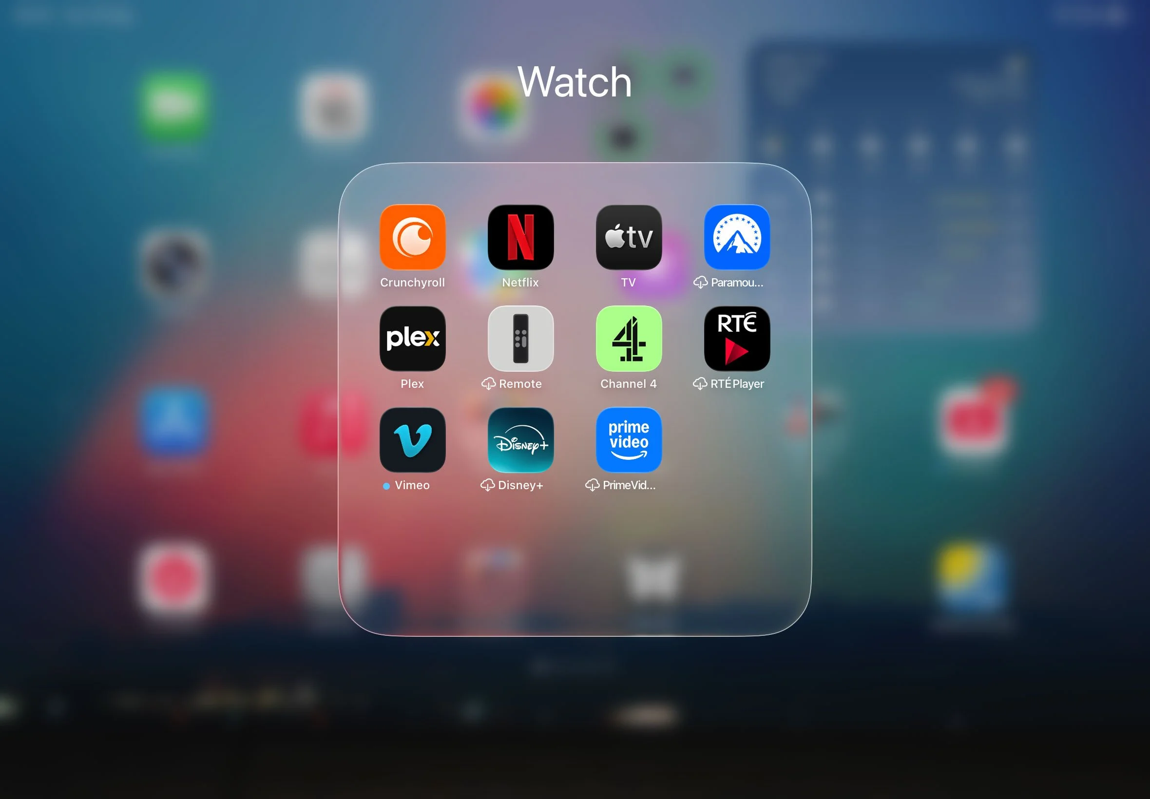
Liquid Glass Folder on iPad
Liquid Glass in macOS
Having used glass as a design element many times in projects over the years, there is one thing that people who aren’t designers may not realise. It’s actually not the easiest of things to work with in terms of either 3D or 2D graphics. This is primarily because what makes or breaks a glass design, isn’t the glass itself, but what it reflects and refracts. Given that they’re not exactly doing ray tracing on this, Apple’s efforts seems pretty good. There are still some aspects that are highly dependent on what is under the glass, but for the most part it works as intended, with a few caveats.
MacOS 26 seems to be the least consistent and polished of all of their operating systems when it comes to the glass. In the menus, for example, all the menus have the same look until you get to the Notification Centre, which has an entirely different look. Now I get that they want to go with the consistent design of Notification Centre on iOS and the other operating systems, but here it just seems unnecessary and at odds with the rest of the menus. Moreover, the area underneath it is blurred, so as not to distract from the menu items, and this just looks weird, even lazy. At times, the glass feels almost bolted on. This has improved considerably throughout the beta cycle, but it still feels like something that is there for visual effect, rather than having a definite function. The iPad definitely seems more “finished” in this regard, and iOS is definitely the best of the three.
Menus, notification centre and spotlight, different implementations of the “glass”.
In my opinion, the biggest issue with it is the inconstancy. Some things are glass whereas some are not, and its not always obvious as to why some elements get the glass treatment while others doesn’t seem to. And even within that, there are inconsistencies in the implementation. Sometimes it is “dark glass” and sometimes it is “light glass”. When you’re scrolling it will switch between the two depending on the background, but sometimes this behaviour is inconsistent and a bit jarring.
This has improved since the first betas, but it still happens, and it’s still a bit weird. The other thing that happens here is that when it displays dark glass on a light background, it will sometimes add a dark gradient to the background window. In my opinion, this is really ugly, and frankly amateurish.
Photos App: Note the darkening at the top of the screen
This issue is exemplified in the Photos app, although it happens in other places too. When you scroll up the main window in photos, the top of the window goes dark. It should be noted the current version of Photos does this to an extent too, but it’s not as bad in my opinion as it’s framed off. It’s also only in certain views, whereas the new version does it in all views. Don’t get me wrong, it still looks bad, but when it half extends under the side panel it draws even more attention to it. You can see this in other areas throughout the various operating systems. It’s present in Mail on iOS for example and again, it’s quite ugly.
In my opinion, this is the most egregious of all the interface issues with the OS26 releases. All the other stuff is relatively minor in the grand scheme of things, but this is pretty noticeable and in my opinion should have been solved before the actual release. Yet, here we are. Hopefully, over the course of the next year, they fix this. I think they could have fixed this for the most part by adding a floating glass background to the text that they’re darkening the view to see.
Incidentally, this problem mostly goes away in dark mode. As does the drop shadow issue (see below).
There’s no doubt that the actual implementation of the glass is actually pretty cool. There’s way items refract under the dock for example looks pretty impressive. You can also see this on iPadOS and iOS with app folders. It looks visually impressive, although it can get a bit repetitive. The problem though, as I’ve said, is that it really depends on the background. It definitely looks better on darker backgrounds than lighter ones, but it really depends on the image behind it. Again, iOS is the most polished and consistent.
Dark Mode
Dark mode looks better when it comes to the glass elements. For some reason, there seems to be better consistency across the elements, and they’re not as in your face. However, light mode has grown on me, as it’s bright and vibrant, there’s just more inconstancy in Light mode.
Curves and Drop Shadows
Another one of the big points of contention when it was first released was the new larger radius curves on the windows. This was to be consistent both with Apple’s hardware designs and across platforms. At first, I thought it was way too excessive, but it’s grown on me to the point where the old versions look dated to me now. On smaller screens it may be an issue, and you may be loosing a small amount of space, but on my 27-inch screen in 5k it actually looks pretty good, in my opinion.
Another thing that I didn’t like at first was the floating buttons. Especially with the drop shadows. The buttons in the finder looked weird at first, but at some point I think they toned down the drop shadows enough that it looks more natural. However, there are still a few bugs here. The drop shadows are still an issue because occasionally, they pop-on to a stronger version depending on the content underneath. It looks bad though when it happens.
Another odd thing that looks kind of cheap, are the blurs in various places. For example, in the sidebar in the finder, if you scroll up and the entries go under the traffic lights, they’re blurred. It just looks cheap and half-baked, like they ran out of ideas, and I can’t help but wonder if there could have been a better way to implement this. This isn’t the only case of weird blurs. You can find it throughout the operating systems. Sometimes it looks natural, and other times it just looks like an afterthought, or that they couldn’t figure out another solution so they just took the easy way out. Maybe I’m being too harsh here, but you’ll know it when you see it.

Notice the blur under the Notification Centre
Icontastrophy?
The other major design issue that is annoying a lot of people is the redesign of some of the icons. Apple has gone for a much simpler design, and some of these are pretty basic from a design point of view. The most noticeable of these is undoubtedly the new internal drive icon. The perspective on this makes no real sense. I get that Apple wanted to move away from the icon of a hard disk, as no Macs use these as system drives any more, but the choice of design was a bit odd.
I actually made my own icons to replace this using a similar SSD design but in the more traditional perspective. I even made a Mac Studio icon too. (And I made these in 3d, not AI). I will have these available to download for free soon.
Others include Automator (I thought it was gone - but I guess not), Disk Utility (pretty bad) and Font Book to name but a few. I kind of get what they were going for here, but the result looks pretty amateurish.
Some of the new “minimal” icon design.
This isn’t really the end of the world, but some of the more purist Mac commentators are using his as a sign that Apple has lost its way. Personally, I think they’re overreacting. As I said at the start of this piece, Apple is doing a massive task here, redesigning all their operating systems at once and unifying the look across platforms, so I am not surprised if some elements aren’t perfect, or just plain bad. It’s not like they haven’t introduced poor design choices before.
Despite some icon issues, overall, I like most of the new icons. I like the new-look mail icon and I even like the finder icon, despite what others have said. Overall, the palette is more vibrant, and it does look nice, a few bad apples aside. You actually really appreciate this when you go back to an earlier operating system.
The ability to change the icon schemes is nice too. I like the dark look to match dark mode when you activate it, and I appreciate the clear options too, but I don’t necessarily personally like it. To be honest, I am not convinced that’s something I would ever use, but I’m glad Apple is giving us more options.
The Menubar
One of the other key design changes to macOS is the removal of the background on the menubar. There was such an outrage to this initially, that they added the option to put the background back. However, after using it for some time, I actually like the new way, without a background. And I didn’t think I would.
If you have installed it, maybe give it a chance. I know some purists will be outraged, as that is one of the most iconic and long time Mac things, the menubar with a background, but it isn’t really that big a deal, and the design grows on you.
iPadOS Interesting tidbits
The headline feature of the new iPadOS is undoubtedly the new windowing feature. While this aims to bring the iPad to a more Mac like way of working in practice, it is a little different. The overall window design is broadly similar, but the traffic light design is different. On the Mac they are anchored to the window, but on the iPad, they are in a floating palette that you have to tap on to make bigger before you can access them. There is a bit of inconsistency as to where they are positioned on a window, but it’s a good way to keep them out of the way until they are needed. Sometimes they are perfectly in line with the corner radius, and then other times they are in line with buttons on the menu, but not with the corners. When you bring up the menu on a full-screen app, you will also get the traffic light controls.
Note the different positions of the traffic lights in the different windows
There are some interesting ways of managing the windows too. You can “throw” them to either side of the screen, and they will resize to half of the screen. You can also double tap on the title bar area and the app will go back to being fullscreen. You can also disable windowing altogether if you'd like to.
The other interesting thing about the window mode is that the menus are present even for apps that haven’t yet been re-written for iPadOS 26 which is a little weird. Does this mean apps had menus the whole time, they were just hidden? Is this something Xcode was doing the entire time?
Lightroom with a menu! Despite not being updated!
In terms of the glass elements, they are more prevalent on iPadOS and much more consistent. The control centre, for example, looks much better on iPadOS than it does on macOS. The app folders on the launcher are also glass, and this has refined enough over the course of the betas that it now looks pretty good. When you tilt the iPad, there is a shine that moves around the edge of the icons that is subtle but looks pretty cool. You can see this on iOS too. My only real wish here is that you could make the dock smaller or add more items to it. It just feels too large. The other thing I’m not overly enamoured with is the way the Notification Centre comes on and off. There is a transition and a glass effect as you pull it down, but then it just sort of pops on in the last 5% or so of the animation. I think this could be better defined.
A Quick Note on iOS
I have mostly covered the Mac and the iPad in this post because those are the two systems I’ve spent the most time with, but since upgrading my iPhone to iOS 26 I have a few quick observations in how liquid glass on iOS compares to the other systems.
For a start, it’s way more dynamic. There are many more animations and transitions on iOS than there are on either the Mac or the iPad. You can really feel the liquid part of Liquid Glass on iOS. It’s quite a noticeable difference, and it’s really quite impressive. It’s a very fluid design and you don’t really get the sense of this from stills or even animations. You have to see it in action as you interact with it.
It also feels way more polished. As with the other two there are still a couple of minor issues such as the darkening of lists ands so on that I’v mentioned previously, but it’s far more solid in terms of the design, in my opinion.
I’m guessing that iOS was the focus and the others will catch up over the course of the next year, in terms of the animations and the fluidity.
Stability and Should You Install?
While there are certainly still some visual glitches and design bugs about the OS, in terms of overall stability I’ve been impressed. I’ve been using the public beta on my laptop for a while now, and I haven’t had any major issues. All the software I have used including Lightroom seems to run fine without any problems. And none of these have been updated for the new operating systems.
On my main computer, I have been running it as a virtual machine under parallels. It was a bit glitchy using this method until Parallels updated to version 26 which now officially supports macOS Tahoe, and now it runs mostly fine. If you would rather not upgrade your work computer but want to try it out, this is a good way to do it.
In the early versions, especially of iPadOS, there was definitely a performance hit from running the beta, but that seems to have gone away now. I don’t notice any performance issues with it anymore, so I don’t think this is anything to worry about unless you have an older machine. I’m running it on an M1 iPad and running macOS on an M1 MacBook Pro, so hardly the latest systems, and it runs fine on these.
So, should you install it? Well, it depends really. If you use your computer for work, and are still in the middle of a major project, then certainly hold off. I won’t be installing it on my Mac Studio until next year at least. Unless I get bored! But I will definitely keep using it on my laptop and on my iPad.
If you do install it, best of luck, and do come back and let us know how you get on!
Final Thoughts
When Apple first announced the Liquid Glass redesign at WWDC, a lot of long time Mac users were pretty upset about it. Some were downright hostile. Others used it to forward the (in my opinion, false) narrative that has been doing the rounds online lately, that Apple has “lost its way.” I’ll be honest, I was less than thrilled with the design initially. But over time, and with the progression of the public and developer betas, I’ve really learned to appreciate what Apple is going for here. I also understand the scale of what they’re doing and I don’t expect everything to be perfect from day one. When the iOS 8 transition to flat design happened, it took a whole version or two before the design language fully settled down, and that was only one operating system.
Despite the fact that this article has mostly pointed out the bugs and issues with the design, overall I think it’s a pretty good Job on Apple’s part. It will take time to get used to as it’s so different, but if you give it a chance, there will come a point where you’ll go back to an older system and be shocked at how dated it looks. Are there still rough edges? Of course there are, but I think as a foundation going forward, it’s a solid one. The true testament to it will be when others start copying it left right and centre. It’s only a matter of time before there’s a wave of glass designed graphics heading our way.
Help Support the Blog
Check out my eBooks and Presets
Check out my photography eBooks , Capture One Styles, and Lightroom Presets available on GumRoad.
Subscribe to my YouTube Channel
Check out my YouTube channel for tutorials, Vlogs, and more!
Buy me a coffee!
If you want to say thanks or help, then you can feed my caffeine habit and buy me a coffee via PayPal with a one off donation to my PayPal tip jar. (Please note that PayPal doesn’t make it easy to respond to these so just know you are thanked in advance)
Note that this post contains paid affiliate links. We get a small commission for purchases made through these links, which helps run this site.