A Little Rant about Photoshop
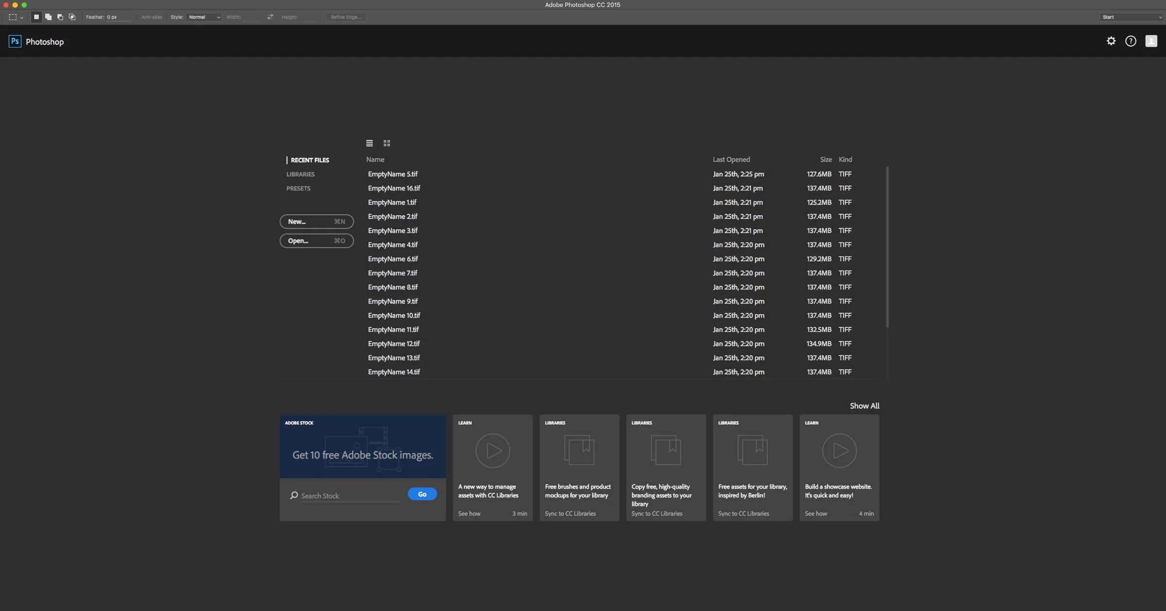
New Photoshop Start Screen
I normally try to keep the topics on this blog as positive as possible. I try not to court controversy by objecting to anything too strongly, but there’s something that’s been bothering me for a little while now, and it’s Photoshop. With the most recent update, Adobe made some significant changes to the Photoshop interface, and in my opinion, they’re not very nice.
There are a couple of elements that are the main things you notice in the re-designed Photoshop interface. Firstly there’s the buttons and dialog designs. In my humble and yes, subjective opinion, the design of these seems to be a regression in terms of quality and look. Instead of proper operating system level buttons, Adobe has replaced them with weird rounded outline buttons, that would look more at home on a web page or a web app. They’re aren’t even implemented consistently either. On a couple of dialogs I’ve noticed that the button text isn’t centred properly. The whole look seems shoe-horned into the existing software.
Then there’s the new intro screen. If you have a small display, it doesn’t look too bad, but on a larger screen it’s a bunch of tiles and buttons stuck in the middle of the screen that looks really odd. there’s no border around it to differentiate the edges, it just floats in the centre of the screen.
Obviously these are all highly subjective comments, and I’m sure someone, somewhere likes the new design. Maybe it’s just the designer in me that finds it hard to look at all the contradictions in user interface, but anyway, I don’t like it. It does however clear up the question as to what they were thinking with the ill fated Lightroom import box. Obviously it was designed to be consistent with the rest of the new start screens and ui design, but as it came out before any of them it didn’t make sense from a design point of view. It didn’t help that it was at complete odds with the rest of the application either.
Old Web Export - Text in the Buttons isn't centred vertically - also, note the space either side of the text in the buttons
Another dialog box - note the super wide buttons compared to the previous version
Different button styles again - thicker fonts and lines, and less space either side of text
Some buttons are still square in Photoshop
But back to photoshop, the changes aren’t just skin deep. There’s the new export dialog box for example, which is supposed to replace the old export for web and devices, yet under the guise of simplifying the experience it seems to have stripped out a lot of the useful functionality from it. Luckily they’ve kept the old one for now, but again, it reminds me of the Lightroom import incident.
I’ve been using Photoshop since version 2.5. I think I probably still have the disks it came on lying around somewhere, and it’s always been at the core of my workflow, both for photography and design work. I’ve never felt that the application is as inaccessible as it is now. It just seems like a confusing mash of features and interface paradigms bolted together on top of an ever ageing software core. It’s like something you would find in some sic-fi painting, where you see some far future cityscape where the buildings are extensions, built on extensions of extensions of extensions of older buildings. Sometimes I don’t even want to launch the application as it takes so long just to open.
If I was to hazard a guess, I would have to say that the designers at Adobe are aiming this new look at tablet users. The design seems to be veering more towards their mobile apps, but in the process, they seem to have forgotten that most people are still using desktop (or laptops) computers. I get that they want a unified approach, but by bolting this on piecemeal, the result is a confusing, ugly mess (in my opinion).
Yet, despite everything that I’ve just said, I still use Photoshop, and I want to like it. It continues to have the features that I need which simply don’t exist in other software programmes, and so I still use it. But I don’t enjoy it any more. Using photoshop used to feel like fun but now it just feels like work.
The competitors are catching up fast too. Pixelmator keeps adding feature after feature with every release and is very competent, not to mention fast. While it doesn’t have every feature of Photoshop, it has quite a lot. It also has a powerful mobile version on the iPad.
Then there’s Affinity Photo. One of this year’s app of the year winners from Apple, it’s another photoshop competitor, and like Pixelmator it does a lot of what photoshop does, in a very nice user interface. It too is fast and powerful, and unlike Pixelmator it has a raw developing function which is pretty impressive, and similar to Adobe Camera Raw. It’s still missing a lot though. there’s nothing like actions for example. It’s pretty new software though, and for an early version, it’s very impressive. The software’s developers Serif are committed to providing the best possible solution and to rapidly developing the software. They’ve also hinted at adding asset management features to the software (or other software) and going after Lightroom too. I definitely think competition in this space is a good thing. I’ll have a more in-depth look at Affinity Photo and Pixelmator, and other alternatives in future blog posts.
Affinity Photo Screenshot - Develop Persona
As I said earlier, I know these thoughts are just my subjective opinions, but people have been emailing me complaining about the direction Adobe seems to be taking on a fairly regular basis. While I don’t have a philosophical objection to their subscription model (but I completely appreciate those who do) I do think the way they’re updating their software has become messy and confusing. The drip feeding of features, and the seemingly random interface changes, makes it seem like you’re participating in the worlds longest beta programme, rather than paying for finished software. It also makes it really hard to know what version is what any more. Which version of Photoshop am I actually running? Is it CC2015, 2015.1, 17, 18? Which version has which feature? (According the the About box the official version number is 2015.1.1) I’ve heard from a few educators and authors that this is becoming a nightmare for them too, when it comes to writing training material. If you have a book about Photoshop, Lightroom or whatever, it’s nearly out of date before it even gets published. I have two books on Lightroom CC and both are missing several key features after only being out for a few months. (And don’t get me started on the differences between Lightroom 6 and Lightroom CC and the various versions thereof, and the confusion that causes when trying to explain which version you need for presets/plug-ins and so on)
Anyway, That’s my rant over with for now! I’m sure I’ve probably ticked someone off with this train of thought. Don’t get me wrong, I don’t “hate” Adobe by any means, and photoshop has been a fixed resident of every computer I’ve owned for years. I’m only offering this opinion because I care! If you agree feel free to share your experiences below, and of course If you disagree with me, feel free to offer your dissenting opinion in the comments too, but just please keep the discussion civil and respectful.
Check out Coffee Tones for Lightroom - My latest set of Creative Lightroom Presets. Available now for Just €5
Help Support the Blog
If you want to get regular updates, and notices of occasional special offers, and discounts from my store, then please sign up for the Newsletter.
All of the work I do here, and the information on this blog is done entirely free of charge and takes up quite a bit of work. I want to spend more and more time on this blog, and offer more and more of this kind of information, tips and so on, so If you like what I'm doing here and want to show support, then you can do so by buying something from my Digital Download Store
I have Lightroom Presets, Photoshop ACR Presets, Textures ande-books all available for download.
If you're a Fuji X-Trans shooter and Lightroom user, check out my guide to post processing X-Trans files in Lightroom. I also have a guide for processingX-Trans files in Capture One


