
New Website Design is Live - Finally
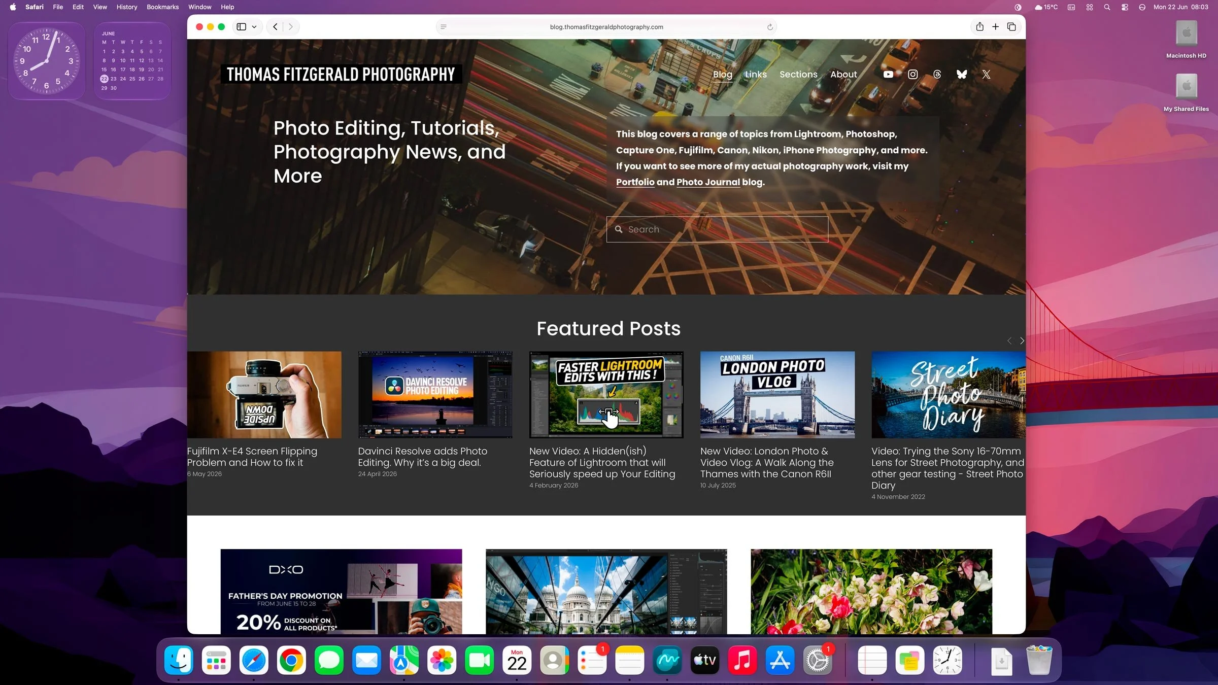
After a lot of procrastination and an impending sense of dread that I might break it fully, I’ve finally taken the plunge and upgraded this site to Squarespace 7.1. This has also allowed me to create a new layout and experiment with some new features. It’s far from perfect right now, and I still need to make some tweaks, but I already think it looks a lot better than the previous one, which was getting stale. There are a couple of big changes, though, and I’ll go through those below.
No more sidebar
The biggest change is that the sidebar is gone. Unfortunately, this is no longer possible in the current version of Squarespace. This was the thing that put me off upgrading the most, but in the end, I realised that hardly anyone ever clicked on anything in the sidebar anyway, so it didn’t really matter. On the plus side, it does give a nice and clean layout, there’s that!
I can technically add a sidebar of sorts to individual posts, but it’s a lot of work, so I won’t be doing that, I think. The other downside to this, apart from not being able to display links in the sidebar, is that most of my posts were designed for a smaller-width column. Now, this is fine for 95% of blog posts, but a small few might look a bit weird.
Featured Image may be missing
The other issue is that the new version no longer automatically puts a featured image at the top of the post. The old version did this automatically from the thumbnail, but the new one doesn’t. The upshot is that I have to add them manually. I’m not going to go back and do this for thousands of posts going back 10 years, so most will have to do without it. For popular posts, I’m doing my best to include them.
Featured posts on the home page
I’ve used this opportunity to add a “Featured Posts” section to the home page, as I’ve wanted to do this before but couldn’t get it to work properly in the old version. I’m not 100% sold on this design yet, and it may need a few tweaks, but overall I think it looks ok and adds some nice functionality.
The featured posts are key posts I think are more timeless or prominent, and they will be updated regularly. I had marked some as featured years ago, and it’s funny to see what came up when I added the block in. Hopefully, this will make it easier to find key posts in the future.
Other miscellaneous points and future plans
So there are still a few bugs and design things that need fixing, and I’m sure I’ll find more. Some of the font sizes are a bit all over the place (hard to fix), and there are some issues with padding, etc. I had wanted to have fewer columns on the home page for smaller screens, but I can’t get it to work yet.
The menu layout is a bit haphazard, too. I had to change this as it didn’t update properly from the old one, so some things may be missing. However, I do like the fact that it’s a proper menu now. I don’t think people even realised the other one was there! I hardly ever went to it, and it was my own website!
I will be adding some more content back into the footer, too, such as links to my presets and so on, but I’m still working on that. I’m also considering bringing back the newsletter in one form or another, but I’m looking at how to do that. There is a built-in one in Squarespace, but I’m not sure it’s the best solution. But I do want to explore this option, as I think it’s the best way for readers to stay updated now, with social media downgrading links and Google reducing its actual search functions.
Anyway, please let me know what you think of the design. I’m not a web design expert, and there are limits to what can be done with the system, so I’m doing my best. If you have any suggestions, please leave them in the comments. Likewise, if you spot any major errors, please let me know.