Changing Things Up A Bit
I’ve been feeling lately that my site design had been getting a little stale. What’s more, it was dictating to me how I approached my posts, and it was getting to the point where I really wasn’t happy with it. It wasn’t just the design in terms of what you see but also the functionality. I was adding bits on and using some cheats to get around certain functions that the theme didn’t have, and it was starting to look dated.
The other issue is that I was getting a little worried about the direction that my blog was taking. It was veering away from my photography and off into more software based stuff, which is fine, as I like covering that topic, but I’m not sure this is the place for it. It was also dictating the design to an extent as well, because, on the one hand, I wanted a nice clean design when just doing pure photography posts, but I also wanted a more flexible layout with a sidebar for when I’m doing more academic or technical type entries. So I've changed the design on this site.
My plan a while ago was for this blog to become my career. I love writing, and I love photography, and so combining the two made sense. Most of my income comes from this either directly via selling presets and ebooks, or indirectly through image sales due to pictures found through things I’ve posted here. The thing is, though, the blog is a bit weird in that it’s sitting on the fence between been a personal photography blog, and a blog about software, and photo workflow, and I’m not sure it’s working to its full potential. I also didn’t think the previous design was working anymore either because of this.
Because I use Squarespace for this, and because I’m not a developer, there are limits to what I can do regarding the structure of the blog. A lot of it is kind of hacks. For example, I would use a square space summary block to add a "related posts" link to the bottom of the page, and so on. The old home page was made up using summary blocks on a static page. This all means nothing to you if you don’t use Squarespace! Anyway, I noticed that some of the newer themes had a lot of the functions that I wanted baked in, and this new one (Tudor) has some nice features. I’ve still had to hack it a bit with some custom CSS, but it’s a first step.
My other problem at the moment is that I’m dealing with a lot of technical issues related to my various websites. My store gives me a lot of grief, and I’ve tried to resolve the issues with help from WooCommerce tech support, but their approach seems to be to blame everything on a theme conflict and wash their hands of any issue. Squarespace is a bit buggy at times too, but not as bad as having to deal wth WooCommerce. There was a while there I was spending more time on tech support for my site and customers than anything else. Which isn’t very helpful.
So, I’ve sort of come up with a plan for going forward. This redesign is the first step. For the moment I still have the sidebar turned on on posts because it drives traffic to my store and that’s what keeps all this going for now. Running this site and my various other websites is more expensive than you might think, and it’s all paid for (barely) through sales from my store, so, while I really want to get rid of the sidebar so to have more focus on the content, it has to stay for now. On the plus side, turning it off is a once click process, some when I’m ready to do it, it won’t take much effort, and everything I post from now on has that in mind as something that will happen in the future.
With that in mind, I am exploring the possibility of making a transition to a new website for my techy, photo workflow and software type content. I think it would probably be better on its own website, but you may disagree, and if so let me know in the comments below. I don’t have anything to announce just yet, but the plan is to get a new site up and running, with some beta invites once the content is on it, and then when it’s ready, announce it properly. I think that this is a good time to do it too. There are lots of things happening in the photo workflow software market right now, and I think this might be a good opportunity to have something out there dedicated to that market.
I’ve made a mistake in the past of launching websites too soon, and then not following through, so I want to make sure this is up and running properly first. I still have some other active sites, so I know I can do it. For example, the Lightroom Diary is still going, and so is The Photography Geek. The other alternative is to keep this site for the software related stuff and transition my personal photography work to a different site. I would really appreciate your feedback on what you all think?
In the meantime, I hope you enjoy the new design. It’s a little more minimalist, and I believe that it better focuses on the content. It also has a built-in "related posts" feature (so no more hacking that on) and a useful floating next and previous posts overlay, as well as a cool status bar. The only thing I don’t like about the design is that the comments are hidden, and it’s not immediately obvious to a reader as to how to unhide them (you click on the “Leave a comment” text), but I think I may be able to fix this through CSS.
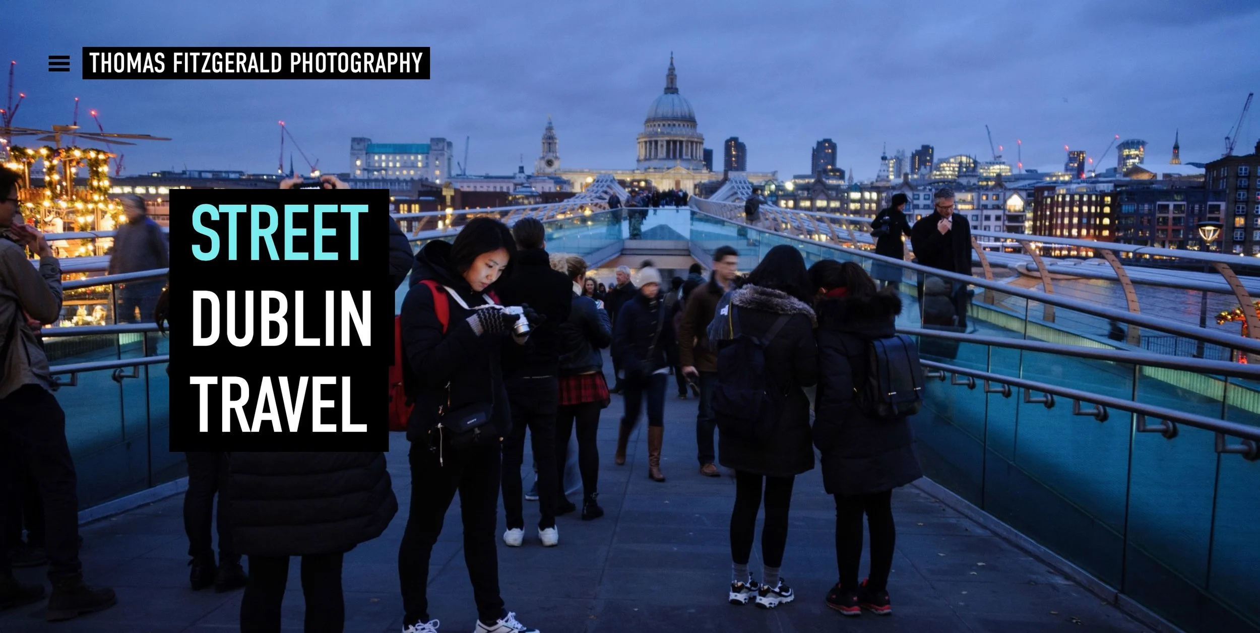
I have also updated my Portfolio site with a new design which is another new Squarespace theme. It’s pretty cool and has some good functionality too, so check it out if you have the time. I’m also in the process of moving my image library from Photoshelter over to Photodeck, but more on that in another post.
I’ll have some more announcements about other plans in the coming weeks before the new year, so if you have any feedback, please let me know, not just on the design, but on things you’d like to see more of, things you’d like to see less of and so on. I would really appreciate it.


