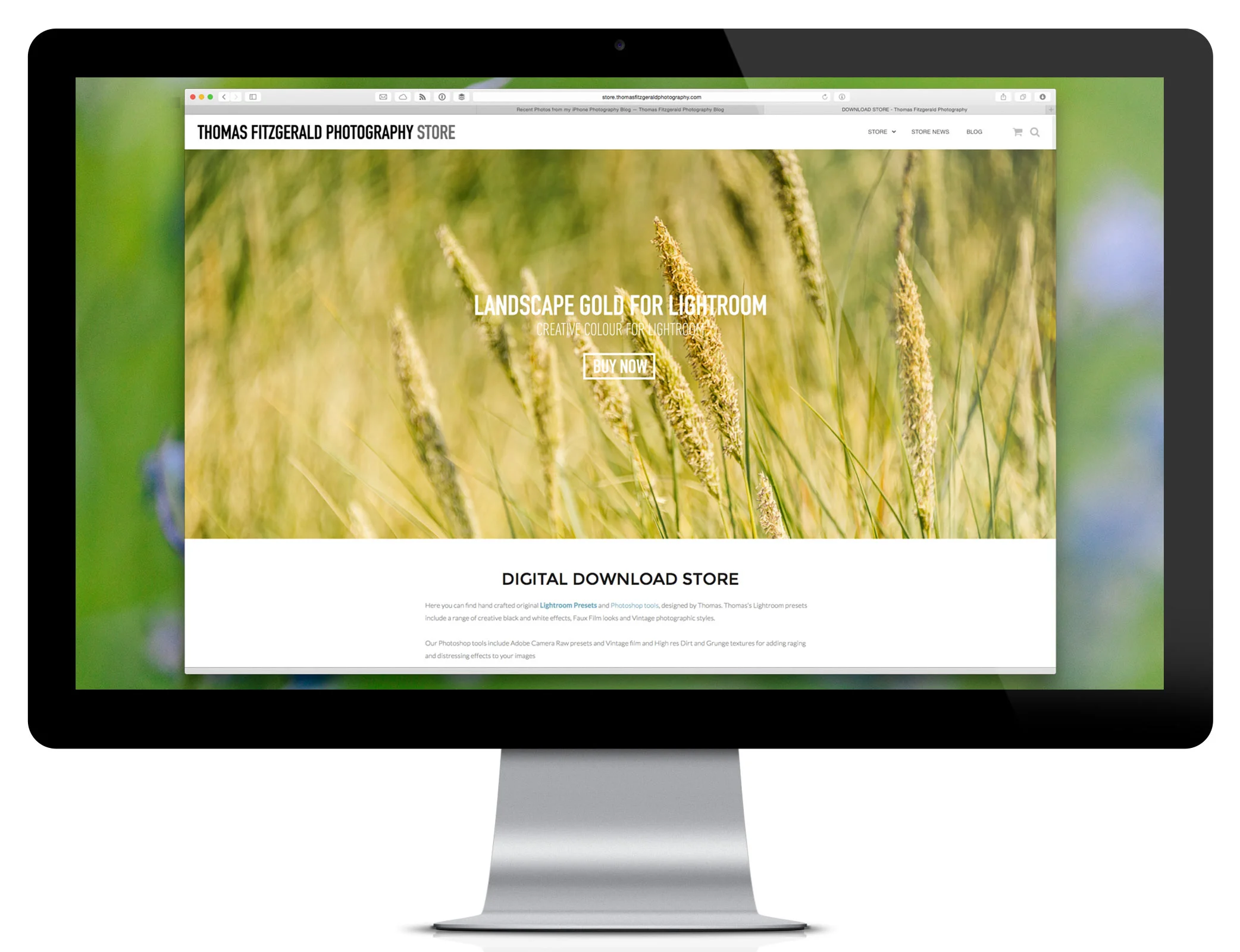
My Download Store Redesign
A while ago I wrote about some of the things that I had planned for my digital download store, and one of those was to implement an updated theme and a re-design. Well, I’m happy to say that I’ve now implemented this, and the store now has a shiny new design. Well, sort of. I’ve updated the theme that runs the store and this includes a lot of the functionality of the individual elements. On the home page, it may not look that different, but there is a new framework there which will allow me to change it over time, and I hope to make it look better.
The most important part of this update though is that it fixes some of the functionality that was broken in the old one. The old theme that I had been using had some bugs in it, especially on the e-commerce side, and as the back end has been updated, the theme became more and more broken. It got to the point where it was starting to get ridiculous, so I set about replacing it.
I’m not a web developer, so for me this was a fairly mammoth task. I’m pretty good at Wordpress, and I know some html and css, but I’m by no means an expert. So, I really didn’t want to go through the process. Usually when you replace a theme, lots of things break and you need to do a lot of manual re-configuration, but luckily this went fairly smoothly. There are still some bugs to work out, but for the most part it’s working and I hope it’s much better.
Fixed
The two main things that are fixed are as follows:
The Checkout
First of all, the checkout has been fixed. There were two big issues with the old one. The first, which is a recent problem, is that for some reason the credit card images were huge and filled the whole page. This seems to have happened with a recent update. The second issue, which is a long running one, is that the option for returning customers to log in on the checkout page wasn’t working. Thankfully, it’s now back, so you don’t have to go away from the check out page if you’ve forgotten to log in.
Mobile
The second thing that the new design fixes, is that it now works much better and hopefully most of the old issues. The menu wasn’t working properly in the old version too, and that works much better too. So now, hopefully the experience of using the store will be much better on an iPhone, or an iPad (or smoother mobile device.
Bugs
There are still a few things that I need to fix. Most of this is because of my afore mentioned lack of knowledge when it comes to web development. For now, some of the blog posts on the store blog may have double images in them and some of them may have issues on mobile devices. I also had some problems with some products not being responsive (i.e. scaling properly on smaller screens) but I think that I’ve fixed that now.
if you find anything while browsing he store that you think looks out of place then please drop me an email.
Coming Soon
Now that I’ve finally replaced the ageing theme and improves some things on the back-end I have the ability to do a lot more things with the store. The next major feature that I want to add, is the much requested PayPal express checkout. With this installed you will not have to fill out your details when paying with PayPal as it will take it from your PayPal account. I know this has been requested by a few customers, and I’m working on implementing it.
I’m also going to be adding a sort of gallery and I’m considering opening it up to users to submit their own images to it. So if yo’e used any of my presets and you want to get your work featured it might be a way to do it. It’s a little ways off just now, but I’m working on it.
That’s about it for now. I just wanted to thank all of my customers for their loyal support over the years I’ve been running the store. I want to apologise for the issues that have been happening lately, but I do all this myself and at times it feels like a full time job, which of course it’s only part of what I do. So again, thank you for your patience!


