A Review of the Camera on the Nokia Lumia 920 Smartphone
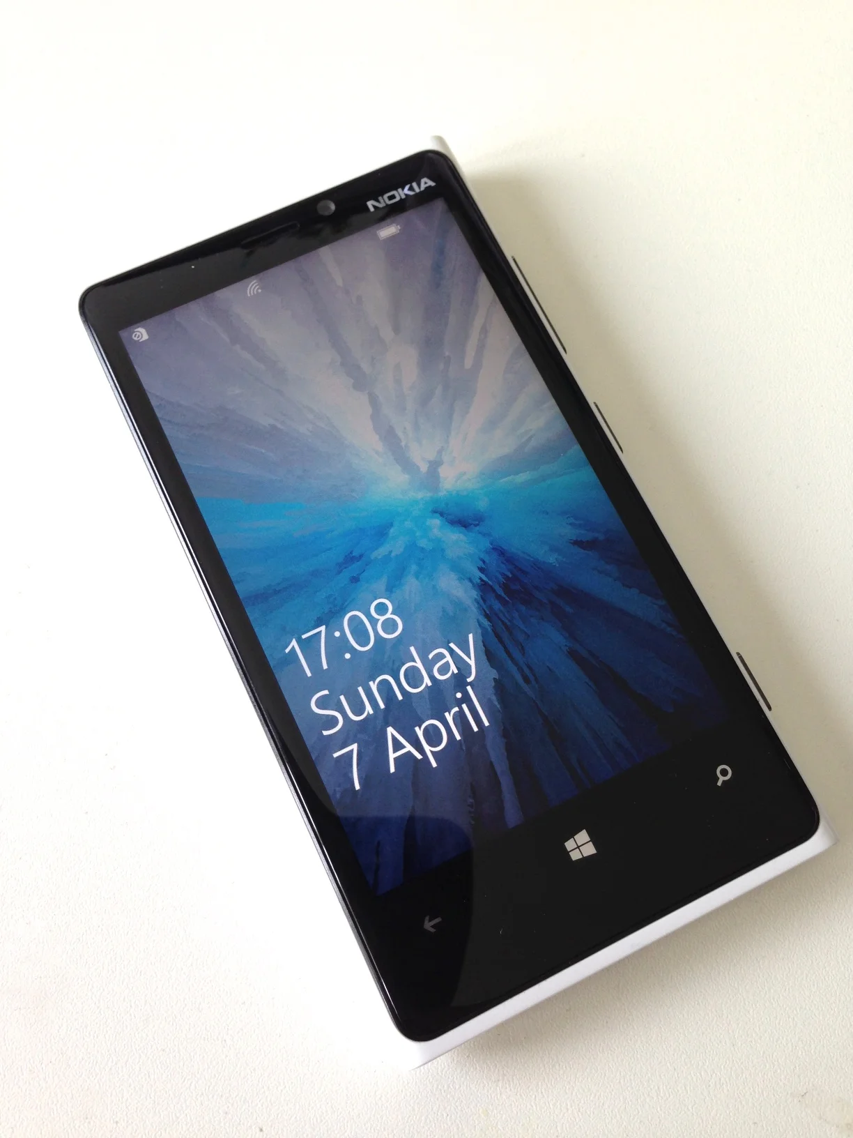
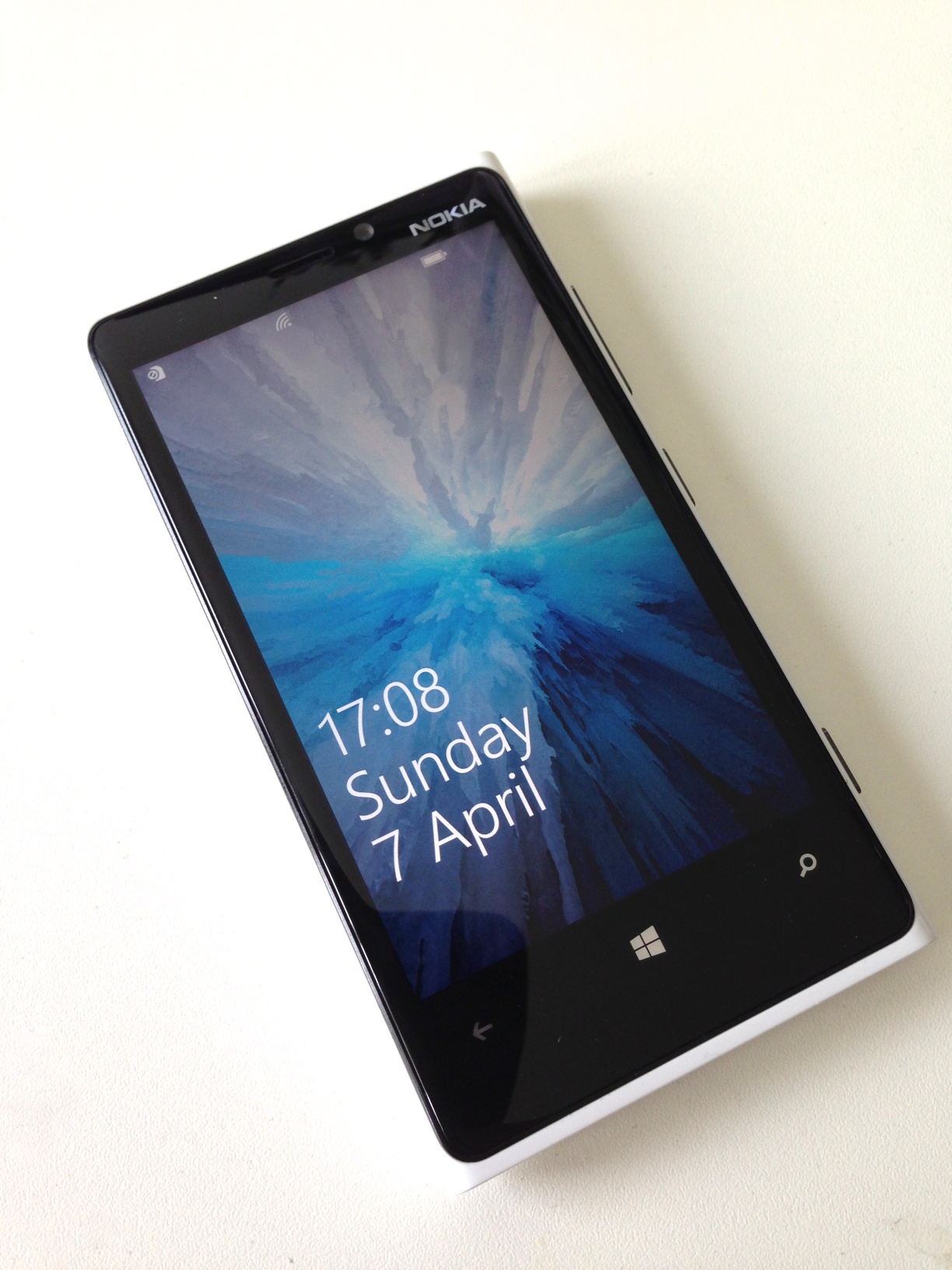
Nokia recently contacted me asking me if I would like to test out the camera on the Lumia 920 phone, and they kindly sent me a review unit to try out. The goal, specifically was to see how the camera performed. As a long time iPhone user I was actually quite interested to try something else for a change, and as a photographer I was curious to see what the Lumia could offer. The phone itself arrived and it was a nice shiny white model. Upon powering it up, the first thing I noticed was the screen. Using such a large screen was a different experience than I was used to. It's not only bigger than my own phone, but also bigger than the display on most cameras. It takes a little while to get used to handling the larger device, but it's a really nice display, and it makes shooting with it a pleasant experience as you have a nice big screen with which to frame your shots. After taking photos with the phone and using it out and about for two weeks, I found some things to really like about the experience, but I also ran into a couple of frustrations that I found difficult to deal with. Just to be clear, I was only testing out the camera. I wasn't using it as a phone (as my nano-sim wouldn't fit)
The one thing I really liked was the dedicated camera button on the side of the phone. Not only can you use this as a shutter button, but you can press and hold it to go straight to the camera at any time, even if the phone is on standby. This is a very useful feature to have and it allows you to quite quickly access the camera.
Another feature that I really liked was the ability to manually set white balance and exposure compensation. These are two features that I really wish that the iPhone had and it's good to see that the software designers decided to include this functionality. My only criticism of the controls is that they could be a bit easier to access. As it is you have to go into the menu to access them. It would be much better if these controls were in the form of some kind of virtual switches or buttons on the main camera interface so that you could access them quickly.
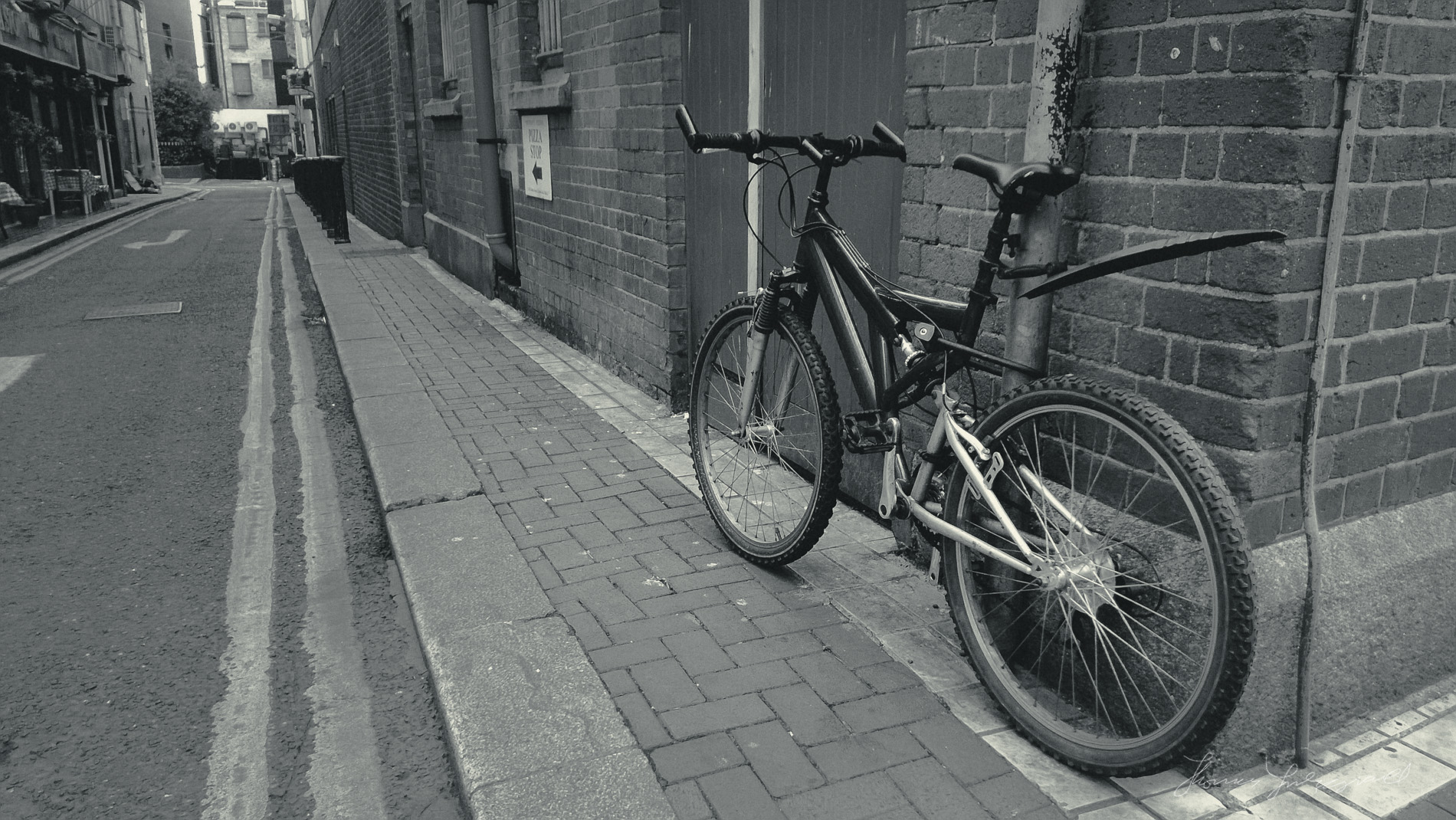
Overall the image quality is pretty good. Subjectively I would consider it somewhere along the lines of the iPhone 4s, but in my opinion, it's not quite as good as my iPhone 5. There is a lot of post processing done to the images and they have a strong "digital" look. I suspect much of this is noise reduction, but it does have a visible effect on the images. To be fair, this is true of most camera phones. However I found that processing the image in Lightroom can remove a lot of this "digitalness", and with a little grain and some tweaking you can get some nice results.
Getting the images off the phone is quite easy. If you sign up for Microsoft's sky drive, you can set it to automatically upload your photos to your sky drive account. They then appear inside your skydive folder on your computer. The whole process is very straight forward and you never need to plug in a cable, which is always a plus.
There were two big issues for me when shooting with the Lumia. The first was the placement of the camera. It's in the middle of the phone about a third of the way down from the top. I found that while holding the phone in normal use I'm constantly touching the camera's lens. This results in quite a greasy lens, which has a big impact on image quality. I'm sure that you could train your hand to not hold it that way, but Nokia should consider moving the camera to the top of the phone for future models, as this is a real issue if you're serious about photography.
The other thing that drove me mad was that every time I went to hold the phone in landscape orientation, my palm touched the screen and I was taken back out of the camera into another mode, or into the switcher. It is really frustrating. There seems to be very little if any accidental touch prevention going on in the software. By comparison, I can do the same thing on my iPhone and my hand will never cause an accidental touch. Im not sure if this is a fault of the design of the phone, or an issue with Windows phone operating system, or even just a bug in the review model, but it was a real pain. It was the single most frustrating issue I had when shooting with the phone. Again, I'm sure with enough time you could train yourself to avoid it, but it's hard with the big screen, and you really shouldn't have to treat it like a piece of fine china just to take a picture without getting bounced out of the camera app.
One other thing that was mildly problematic was the lack of software. While there are a few interesting looking apps in the Windows Phone App Store, there is no Instagram, and none of the other applications that I am familiar with. It's not that big of a deal, but I particularly would have liked to try Instagram on it.
Overall I think that it is a potential contender for photographers who want a good camera phone, but it has some real issues that I hope Nokia will address in future version. Image quality is fairly good, and the big screen is great to use, but the accidental touch activation is very frustrating, and the position of the camera means you need to constantly clean the lens. It certainly has potential, and physically it is a very nice device, but for me the issues were just too frustrating to really enjoy it as much as I had hoped I would.

