A Review of the “Exposure” Photographer Publishing Platform
For a while I’ve been following the development of “Exposure”, a photography oriented publishing platform. Exposure is designed to create “Photo Stories”. I think it would be wrong to think of it as a blogging platform, because the results are more like glossy magazine articles. The platform is heavily focussed on design, and the stories you can create using it’s web based interface look like something you would see on a polished site like the New York Times for example. Some of my favourite photographers have been posting stories on the service and I’ve been wanting to try it out, so I decided to use the opportunity to both test the service and review it for my readers (that would be you reading this right now!)
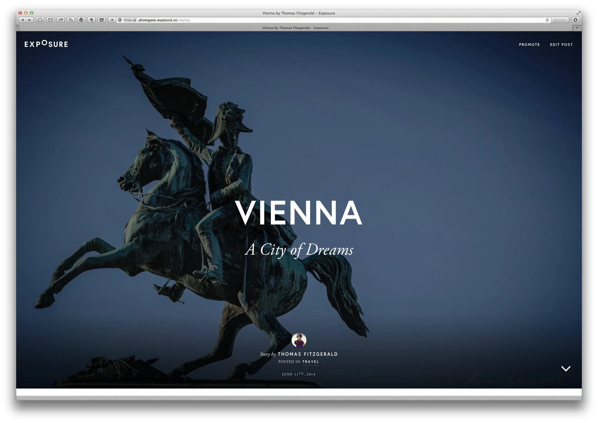
For the purposes of reviewing and evaluating the platform I took a selection of Images I had from one of my Vienna trips. These are the same Images I had previously used to create the Vienna book that I have on Blurb. I already had some text that I’d been writing about the city and my visit there, and so I used that as the basis of the text.
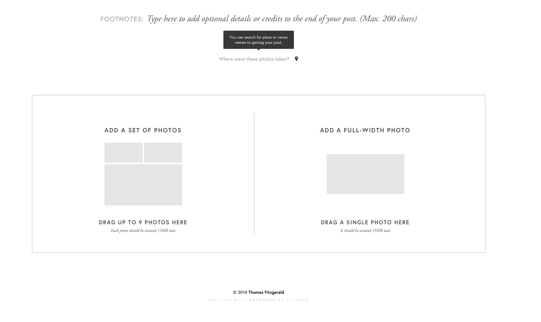
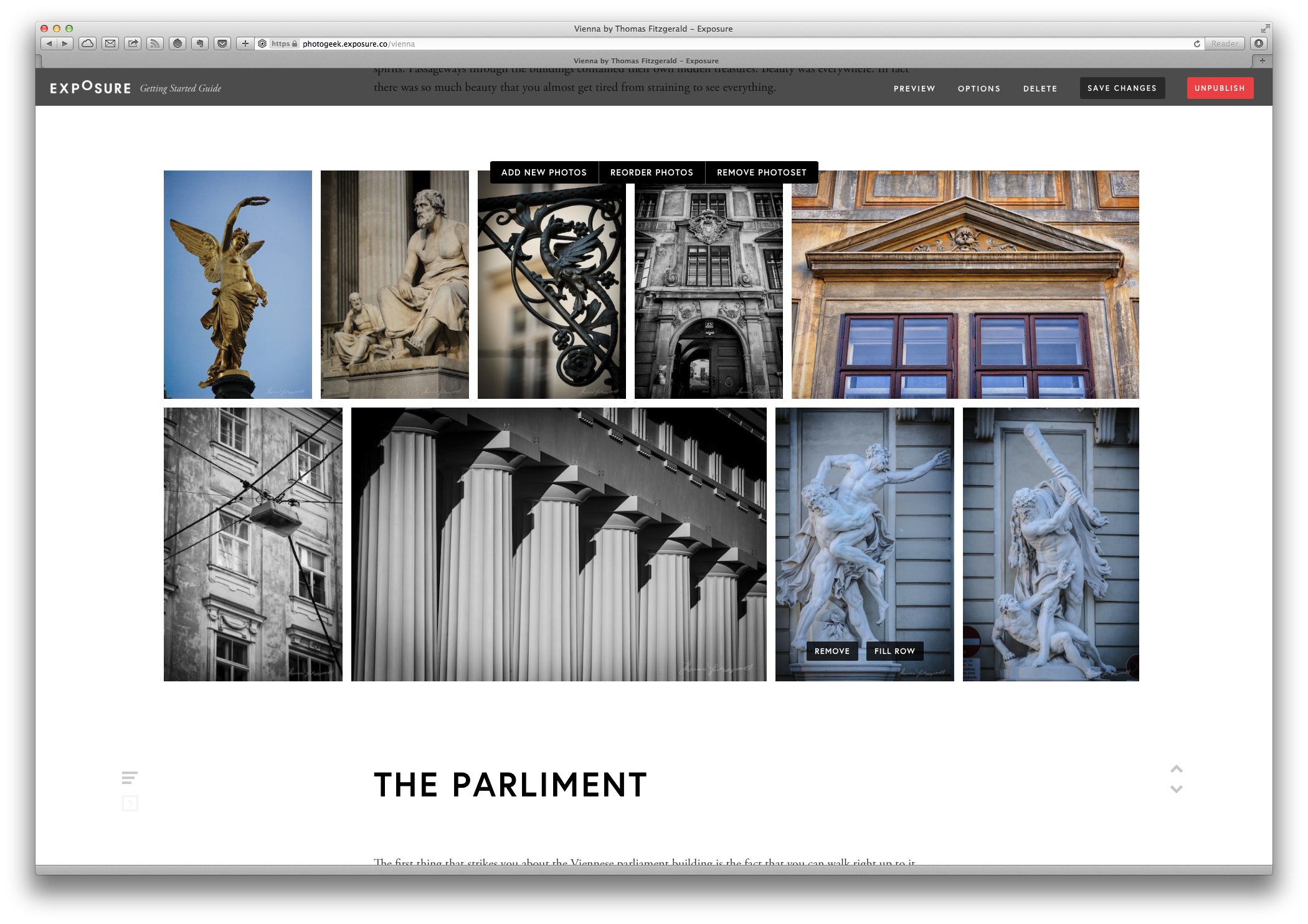
Once you sign up, you start creating your story by adding the cover picture and setting the title and sub title. You add to your story in blocks. This can either be a set of photos or a single full width image. Each block can have a corresponding set of text. Each block puts the text above the photos. There doesn’t seem to be a way of adding stand alone blocks of text. At first there doesn’t seem to be a way to add standalone image blocks either, but it’s just a matter of not filling out the associated text
The controls are actually pretty straightforward, and you really have to admire the minimal design. It keeps the functionality wrapped in a very simple interface. It’s very easy to get a beautiful looking post up in a short space of time, however trying to mentally sort your story into the default blocks can take a bit of getting used to. The structure is rigid, and you need to conform to that, but it does work once you get your head around structuring your story that way.
There are a couple of design oddities about the site that I came across while going through the process. When adding the title, the text is in a nice lowercase font which actually looks quite well, but when you publish it turns to uppercase. In the FAQ it says that this is an aesthetic choice, but as it’s a WYSIWYG editor, I don’t get why it’s in lowercase to begin with. I know this is a little thing, but as a design focussed site it’s a bit of an odd decision.
Another annoying little issue is the inability to re-position images that are the wrong size for the header. For example if you want to use a portrait orientation image, it fill fill the size of the placeholder, but it won’t let you re-position it, defaulting to the centre of the image. Again, it’s a minor little issue and I’m being very picky, but it’s something to be aware of.
One of the funny things that I’ve noticed when looking at other photographer’s exposure posts, is that they all seemed to feature centred text. I was worried that you can only use centred text, but that’s not the case at all, however, if you want centred titles, then everything has to be centred, which seems a little silly. Personally I would always go with left justified even if it means that the body text is left justified. Large blocks of centre justified text looks ridiculous (but that’s just the designer in me talking!!!)
I found that after a while the interface started to get slow. I did have a lot of large images on the page, but then, this is what it’s designed for. I’m not exactly running a slow system either. I’m using a 12 core Mac Pro with 20gb ram, so it’s unlikely that my setup was the issue. To be fair, it wasn’t a huge deal, but it did start to get very sluggish and it wasn’t obvious that anything was happening.
The bigger and more serious issue however was that the “save and publish” button didn’t seem to do anything when I was finished and ready to publish my work. In the end I had to re-load the page, and while it kept my images, it had lost most of the text that I had entered. I had to re-edit the post and start again. I haven’t seen or heard of any stability issues and I couldn’t find anything on the web about others experiencing similar issues. (But it’s a hard subject to search for it because google just brings up posts about “exposure” in terms of getting your photo’s exposure right.) I emailed the folks at exposure and they got back to me immediately, for which you have to be impressed. After some back and forth they suggested that one of my safari extensions might be the culprit, so I’m going to give it another go and see. As I said, I’ve never heard of anyone having this kind of issue with exposure, so hopefully it was just an unfortunate bug.
Stability issues aside (which appears to have been just an unfortunate software conflict) the end results are beautiful and a wonderful way to show photo heavy posts. The design really is great. It’s simple and minimalist, and it puts all the emphasis on the photography. The interface is simple and easy to use and it makes it really easy to get great posts up fast. I can’t wait to see how the service develops in the future.
You can see my finished Vienna story on Exposure here.
Please Help Support This Site
I am a fine art Photographer and do not shoot commercially. If you like what you read here and want to help support the site, then please consider buying a Print, checking out my new Lightroom Presets

