Working The Scene with the Captain
Scott Kelby has a really great seminar over on Kelby Training online talking about composition. One of the things he really hammers home in it is the concept of "working the scene". I think this is probably the biggest thing that separates beginner photographers from the advanced and pro shooters. So many people believe that a professional photographer just walks up to a scene, takes out their camera and instantly gets the perfect shot. Anyone who is in the industry will tell you that of course that's not the case at all. When you see an interesting subject, it takes time to consider it from all angles. Just like a designer, you need to go through many iterations before you get it just the way you want it. You may not always be happy with the result but the important thing is the consideration and the approach. It's the difference between making a photograph and taking a photograph. Sure, if you're a photo journalist, then things are much different, but even then, the fantastic shots you see in news papers or magazines are usually just one of a large lightbox of rejected shots. Here's a rather lame example, but it illustrates the point. I was walking down Grafton Street in Dublin today (one of the main shopping streets for those not familiar with the city - think 5th Avenue, but only about two blocks long and without the fashion shops. Ok, maybe don't think 5th avenue, but you know what I'm getting at) and I noticed this rather cool window poster for Captain Americas (The Diner). I thought it was pretty cool so I took out my camera and tried to get a good artistic shot of it.
Here was my first attempt:
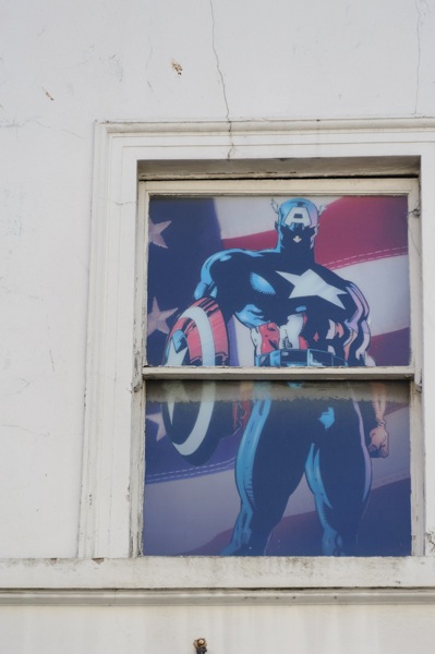
Not exactly riveting stuff. Or artistic. Or, good. Anyway, that was the first shot. I then took a whole bunch more….
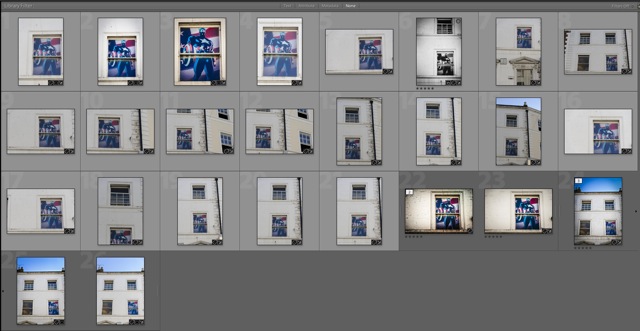
So, how do you go about knowing what way to approach it? Well, some of it is instinct. After a while you just know what to do. You can approach it methodically but what way you look at it is really up to you. In a way, one thing leads to another. Of course, an understanding of composition is important, but also knowing when to break the rules. In this case the first shot (above) I was trying to be clever and position the subject off centre in a lower corner, but it didn't really work out that way - and doesn't look good. So then I went with l lower centre:
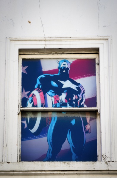
That's a bit better but that doesn't really work too well either. Positioning the subject lower only really works if there's enough going on around it to act as a counterpoint. In this case, there isn't. So, let's try filling the frame with the window...
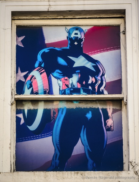
Much better, but it's just a picture of the poster at this point. I've tweaked it in Lightroom too. It's better, and it's ok as a document of the window, but it's not really artistic.
So keep shooting.
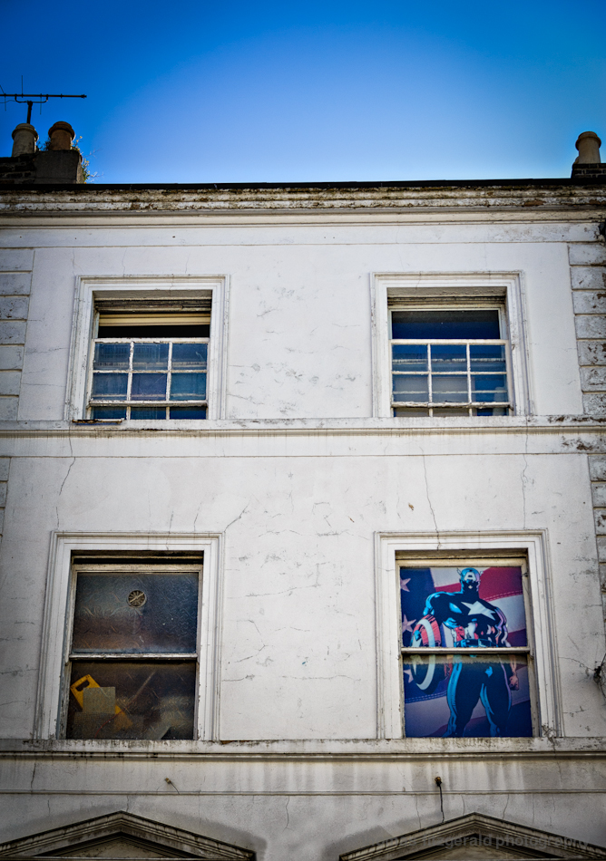
Ok this is much better. It puts the window in context, but now it's kind of lost in the composition. Your eye doesn't really know where to go. I've processed this in photoshop a bit, and you could probably do a bit more to draw attention to the window but it's just not working for me. This was actually shot later in the session. On the shoot I liked this frame, but I wasn't sure. Turns out I had already shot my favourite one, so it just goes to show, that you should cover yourself when working a scene too. Make sure you've got the shot before walking away. And sometimes you will get a few versions and then later you'll work out which was the best. A lot of it is subjective too.
Keep shooting….
Here's another version.
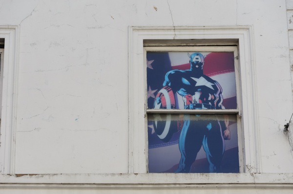
This kind of works too but it's a bit bland. We're seeing more of it in context, it's closer and it's the clear subject of the frame. It's not centred either. the composition is ok. It's not great. So, lets go a bit closer and see what we can make from it in post processing….
Much better compositionally. The grunginess tells a story and the hero in the window contrasts strongly with the grunge and distress of the outside wall. This is my second favourite shot. I like the way this worked out. But it's not my favourite….
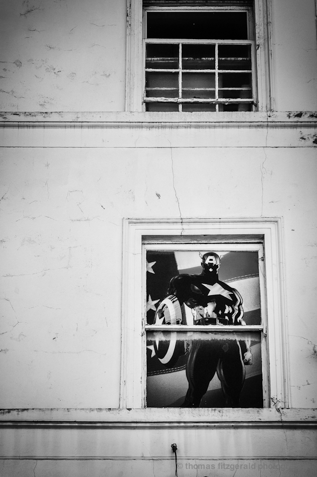
This one is...
For me this is the best (although I do like the previous one too). The composition is spot on (subjectively, in my opinion) and making it black and white has created a nice rich contrast. It makes the subject part of the scene, and the window is no longer the whole story. The story is now the whole scene of the window standing out in this wall, which is what I wanted it to be from the start.
Anyway, I hope this has been informative. This kind of all happens on a subconscious basis, and I didn't even set out to photograph this scene - I just came across it and had my camera with me - but it's interesting for me to go back and dissect my thought process.
Ok, all this talk of Captain America's is making me hungry....


