About that import dialog
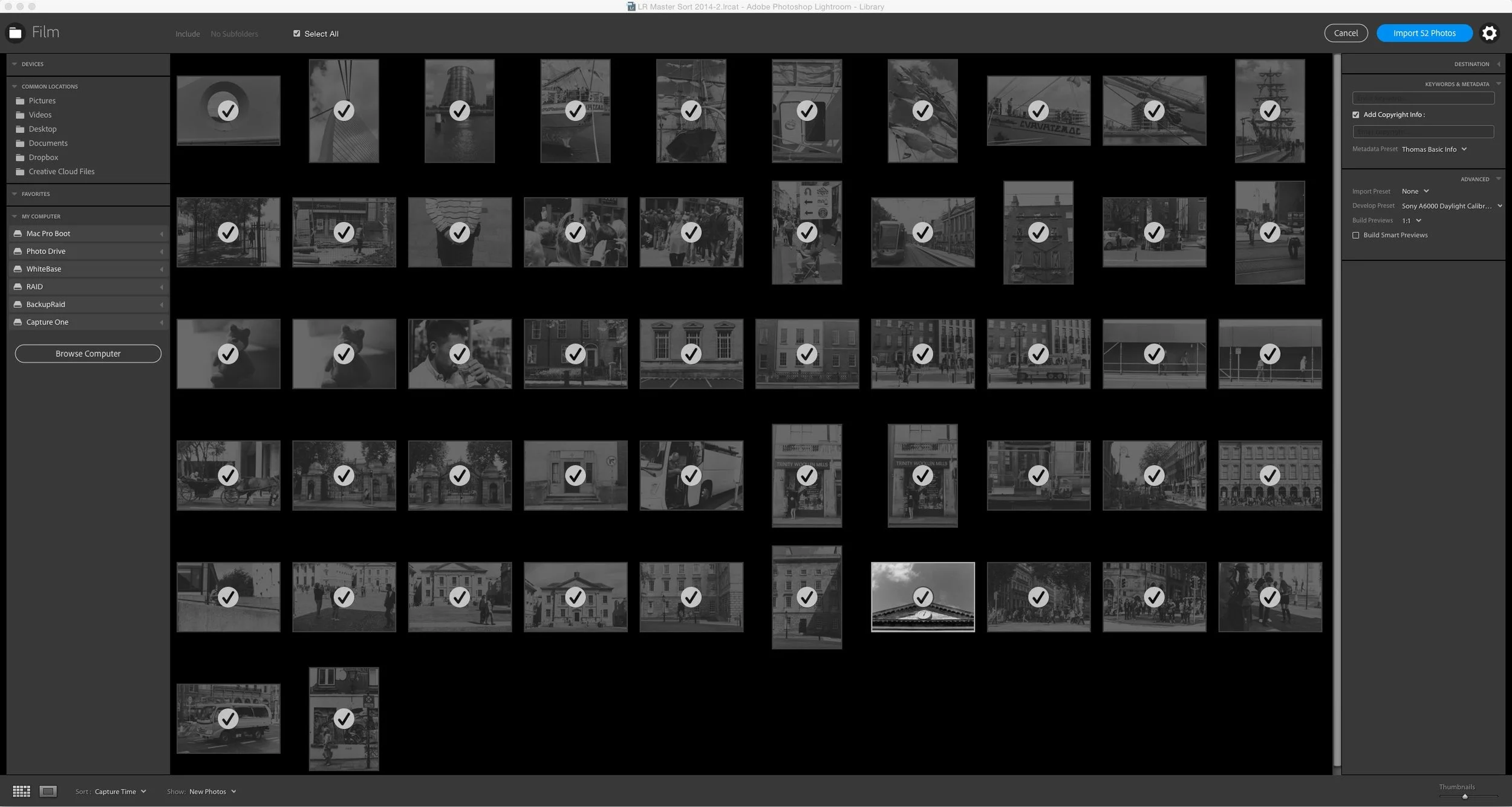
Ever since Adobe announced the last update for Lightroom, ( Well, the one that came before the rushed out fix) there has been a lot of debate about that new import dialog. People are not happy. I have avoided trying to weigh in on the issue because I haven't really had the time or the energy, but the discussion has raised some interesting points, so I feel that I should add my two cents. Actually, a lot of what I think on the issue has already been said by some others
(This post was first published on The Lightroom Diary)
Scott Kelby had a very good post on his thoughts about the "upgraded" dialog box over on the Lightroom Killer Tips site. I know that some people see Scott as an Adobe "yes man" (Which I would strongly disagree with) but he doesn't like the new import dialog and is quite forceful in his opposition to it. I completely agree with the arguments he makes. The re-designed import window didn't add anything and actually took away features, and while it's not the end of the world, I just don't see the logic of it. There was another post on the killer tips site too from another photographer who made the point that Adobe seems to be trying to expand the audience of the software, and I have to say, that's what struck me about it too. And I have to agree that this is a bad thing to do as it feels like it is at the expense of the core audience.
I don't have too much to add. One other thing that struck me about the new import dialog, is that the design is very odd. It's completely different from the rest of Lightroom. I'm not sure why you would want to do this, unless they're trying it out a new look for the rest of the software. But the design looks more like a web page or a web app, or even a mobile app than pretty much anything else Adobe does. I'm just talking about the import dialog too, not the "Add photos" screen, which I immediately turned off.
It's almost like they're trying to make the desktop app more like the mobile app. Which, in a "twisted logic" kind of way, I guess makes some sense. Adobe probably sees the mobile app as a gateway to gaining more creative cloud subscriptions. By giving away the mobile app now, they're probably thinking it can expand their market share for the desktop app as well, and they want to make it look familiar. I don't for a second agree with this approach, but I can see why they might think that this is a good idea. But if that is the case it's a real pain in the ass for professionals. There are plenty of things that could have been fixed with Lightroom's import mechanism. For one, they could have speeded it up. This has long been a complaint. They could have added multiple card importing, which is a feature that Aperture had. They could have addressed some of the bugs in it (for example, thumbnails blacking out, dialog boxes not accepting commas or periods every now and again, to name a few). Of all the things that could have been done, dumbing it down was probably not very high on anyone's wish list.
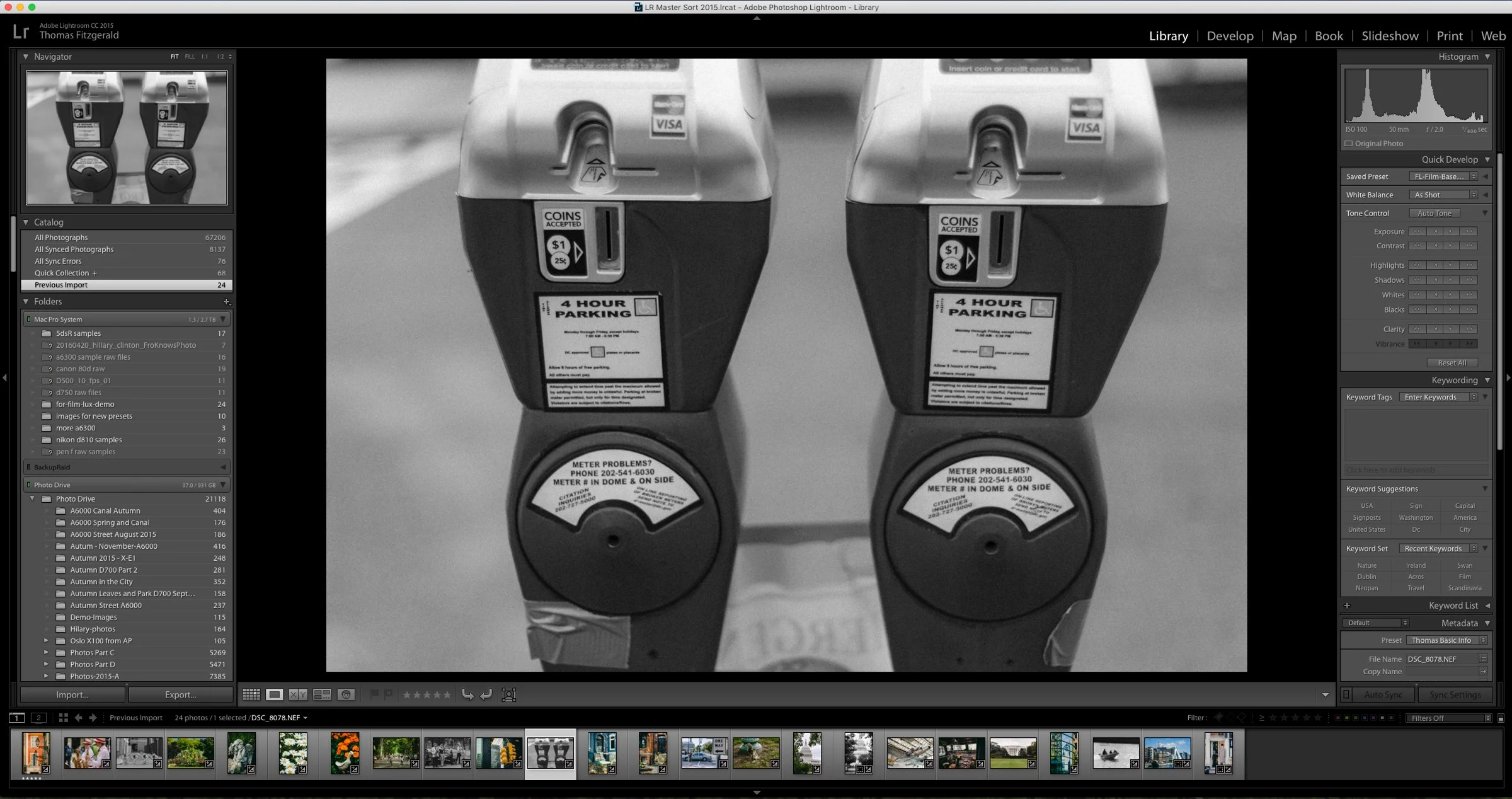
For those saying "It's not being dumbed down, it's just different", there are several features that have been removed, for no real reason. The list of folders is gone, so you no longer have a quick way to re-import into an existing folder, you have to go and find it through the file system dialog. The eject card button is even gone.
I think Scott's solution is the best one in the short term. Give us an option to have the old dialog back. I get that Adobe want's to push out updates and new features to justify the Creative Cloud subscription, but it needs to slow down and perhaps focus on fixing bugs and improving existing things before fixing what wasn't broken to begin with.
UPDATE - Previous Import Dialog To be Restored in Next Dot Release
Lightroom Product manager Tom Hogarty announced via the Lightroom Journal Blog that Adobe will restore the original import functionality in the next dot release. Here's what he said:
I’d like to thank our customers for their patience while the team reviewed several options for restoring import workflows and addressing quality in Lightroom. We can now confirm that, in our next dot release, we will restore the previous import experience. We are still working on details and timing. In the meantime, if you need to restore previous import functionality prior to the next update, please refer to this document on how to roll back to Lightroom 6.1.1 (https://helpx.adobe.com/lightroom/kb/roll-back-to-prior-update.html).
We will continue to investigate ways to improve the ease of use of our photography products and will do so via an open dialog, with both existing and new customers.
Regards, Tom Hogarty

