Lightroom Editing - The basic adjustments I do to most images
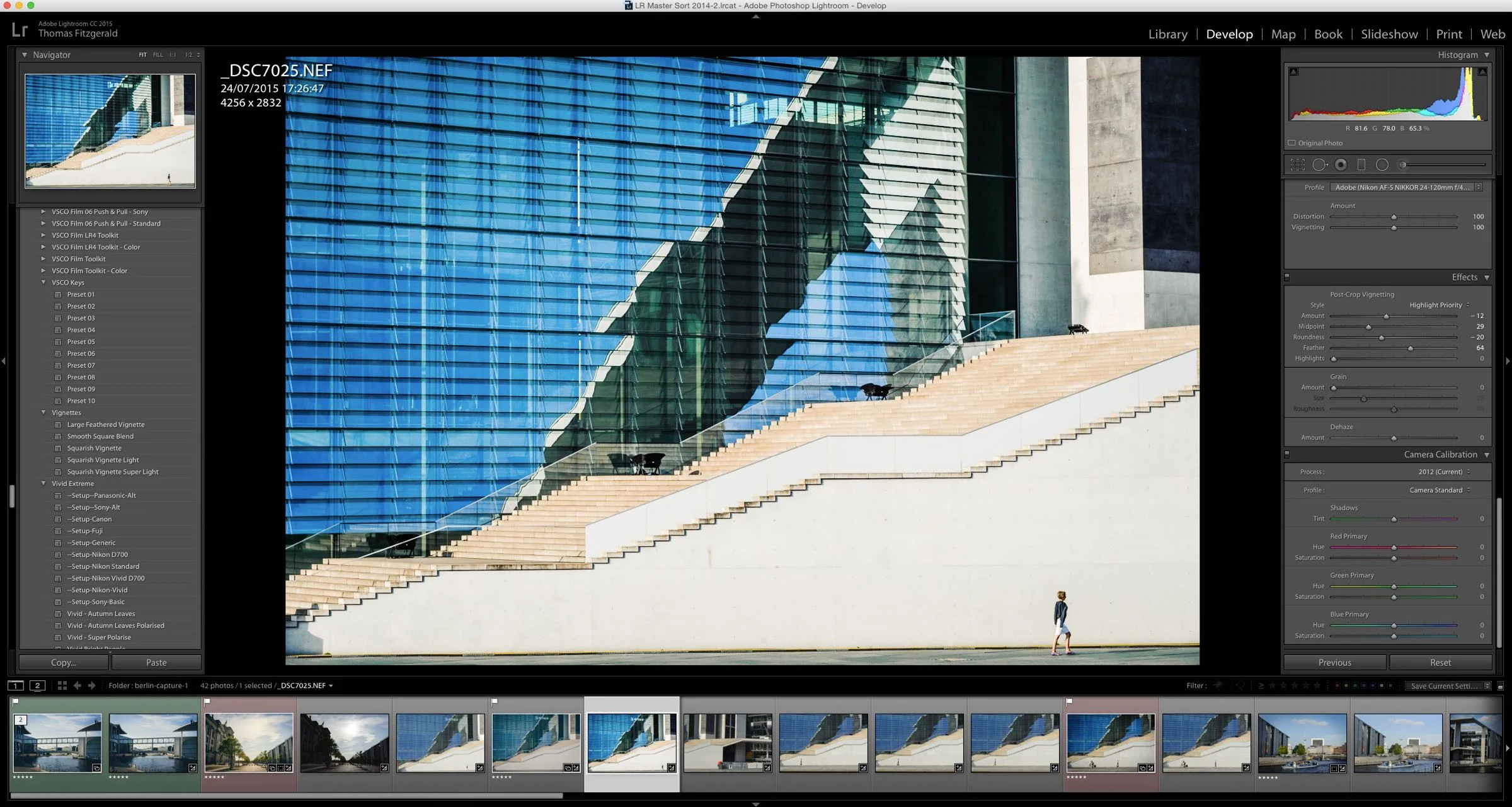
Someone recently wrote to me and asked me how I got my images looking so punchy. They assumed I was using some sort of plug-in or preset. While I do use presets a good bit (obviously) most of the time, I just do some basic adjustments to an image, depending on what Im trying to achieve. A lot of the time I don't want an image to look too treated, so here are some of the things I do in Lightroom to add some "punch" to an image.
Setup Presets, and The basic settings I do for every shot
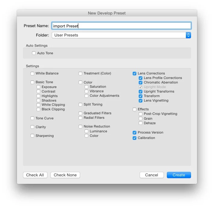
There are certain things I like to do on every shot. In fact I've made a set of Setup Presets for my various cameras that I'll apply in the import dialog box when importing the image. These are as follows:
- Set the camera profile. For most cameras this will be set to Standard. This usually is based off the "standard" picture profile in most cameras. There are a few exceptions though, which is why I have several different import presets set up for different cameras. For my Nikon D700 for example, Adobe released several profiles to fix bugs in earlier versions, but kept them around to maintain compatibility. The current one is Standard Version 4. For Fuji X series cameras, there's no Standard profile as such, so I usually use either Provia or Pro Neg High
- Enable automatic lens correction and Chromatic aberration reduction. These can be done in the Lens Correction panel. In the basic tab, tick the boxes for "Enable Profile Corrections" and "Remove Chromatic Aberration." In the Profile tab, make sure that the Setup pop up menu is set to Auto. This will select the lens profile based on the metadata of your raw file, and it will match it t a lens profile if you have one. If not it will ignore it.
That's pretty much it. For the rest, I let Lightroom use the default settings,and when saving a preset to use on import, I just save the settings I've changed, which in this case are everything under the lens correction header, and everything under the calibration header.
If you've bought any of my Lightroom Presets, they come with a range of "Setup Presets" which are basically these settings for various cameras that you can apply on import.
My Commonly used Adjustments
Once I have those settings set up and applied on import, I will start tweaking. Most of the time I'm aiming to do as little as possible to an image, but enough to make it stand out. I start in the basic panel and work my way through the adjustments. Here's what I usually tweak
White Balance. I usually set this in camera, either to daylight or auto. In lightroom, I will sometimes want to warm an image up, so I'll slide the Temperature slider to the right a bit. You should use very small increments when adjusting the white balance, as a little can make a big difference.
If your image looks purple, which can happen sometimes depending on the camera, especially in certain conditions when white balance is set to auto, then adjusting the tint slider can usually fix this. Again, you need to move this in small increments
Contrast. Depending on the image I'll generally add some contrast using the contrast slider. Usually, I keep the value below +30 (the first notch on the slider) but it depends on the image. If the exposure needs adjusting, I'll tweak that too.
Shadow and Highlights. If there's sky in the image and the clouds are burned out, I'l use the Highlights slider to bring the levels back in. How much to use depends on the image.
The same goes for the shadows slider. I'll bring it up a little if there are dark areas that have lost detail. The more you raise the shadows though, the noisier your image will get, depending on your camera
Whites. I generally leave the whites slider alone unless I absolutely need to. You can use this slider like an over-all "volume" control for the levels in your image. It works much like the white point on a levels control. Raising the whites has the effect of stretching our the whole histogram from the shadow side. The down side is you can cause images to clip easily if you're not careful
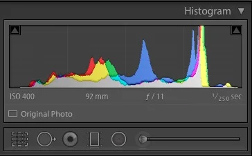
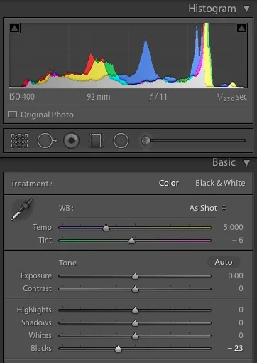
Blacks. I generally use the blacks slider a bit more. I find that for some reason, the raw files from some cameras have their black levels raised, and this results in images having washed out blacks. You can recognise this problem easily because there will be a gap on the let side of the histogram. This is easily fixed by dragging the black slider down.
You can use Lightroom's clipping warnings to see if you're pushing the white or black levels too far. These can be activated from the histogram. You can activate them temporarily by hovering over the little triangles on the top at either side of the histogram. You can also click on these to toggle the display on and off. The clipping warnings will show solid red for whites that are clipped and solid blue for clipped blacks.
Clarity. I generally add a small amount of clarity, usually +25 or less. Sometimes, if it's a low contrast image to begin with, or if there's a lot of texture in the image and you want to bring it out, I'll add some more.
Vibrance and Saturation. Depending on the image, I'll usually add some vibrance, but I will avoid using the saturation slider in most cases. Like in most of the previous cases, I try to keep the adjustments small, so I usually only go to the first notch on the slider (+25) but it depends on the image. Sometimes I will turn the brightness up and the saturation down a little which can give kind of a filmic look to the colours
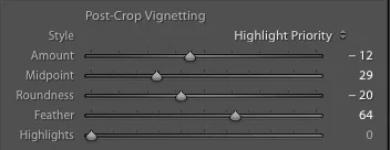
Vignette. The other thing I add a lot is a vignette. Depending on the image, this can help focus the attention to a specific part of the image. It can also help add a bit more contrast. Again, I generally start low and work up. I have made a number of vignette presets over the years that I like to use, which use the roundness slider and the midpoint to create a more "squarish" vignette. Again, these are included with some of my Lightroom presets, but here's an example of some settings that I'll typically use
Thats about it. These are the basics that I'll do to most of my images. Obviously I'll do a lot more if I want to be creative, or if the image requires fixing. I hope this has been somewhat helpful, and gives a bight of insight into my process. There is of course so much you can do in Lightroom, and it's easy to get carried away, so it's best to start small and work from there. Sometimes even small adjustments can make a big difference.
Like what I'm doing? Please Check out my Photography Tools:
Lightroom Presets & Photoshop Tools Including Camera Raw Presets and Photoshop Textures
I'm being social....follow me on...

